Hulu
Adding restart and bookmark progress features to Hulu.
Client:
Hulu
My Roles:
UX Researcher
UX/UI Designer
Prototype Testing
Hulu is an all-in-one streaming service that offers a wide variety of live and on-demand entertainment. Through a range of subscription options users are given control over their streaming service. Hulu was recorded having around 48 million paid subscribers in 2022.
The Problem
Hulu users have reported frustration with re-watching tv series. Currently a user wanting to re-watch a tv show or episode would have to manually move the progress bar back to the beginning of the show for the chosen episode or every episode.
The Process
Research
Research Objectives:
The addition of the “Restart” feature to Hulu’s current application will be successful if the feature can accomplish the following...
1.Increasing user satisfaction.
2.Save user time by eliminating time spent manually restarting a show.
3.Increase usability
Competitive Analysis:
I began my research by taking a closer look into the process of re-watching shows and movies on Hulu’s main competitors. I looked at not only the functionality of the process, but also the design and accessibility of the competitors re-watch process. If the competitor lacked the ability to easily re-watch I analyzed the current way to re-watch both shows and movies.
Nexflix
Netflix allows users to 'restart' shows and movies that they have already watched. Max's design incorporates a mix of imagery and iconography on each show/movie description screen. Additionally, Max utilizes a clear glass design for its restart button, giving the design a less cluttered appearance. The Restart feature enables users to re-watch the entire show/movie, which may limit users who are looking to re-watch or restart only specific seasons.
Max does not offer a 'restart' feature for shows and movies that users have already watched. In contrast, Netflix's design includes a preview of the selected show/movie within the show/movie's description screen. However, some users may find the description screen design to be a bit cluttered and overwhelming. Currently, to re-watch seasons of a show on Netflix, users must either clear their watch history (which can be difficult to find and do) or manually move the progress bar back to the beginning of the show/movie.
User Surveys:
I posted the user survey on a community discord server as well as privately sent the survey to current Hulu users. The survey participants consisted of 13 people with the majority of participants being women (92% of participants) ranging in ages 17-25 (84% of participants).
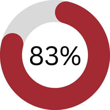
83% of participants reported being interested in the idea of the addition of a restart feature.

Over half of survey participants reported re-watching shows and movies occasionally and frequently
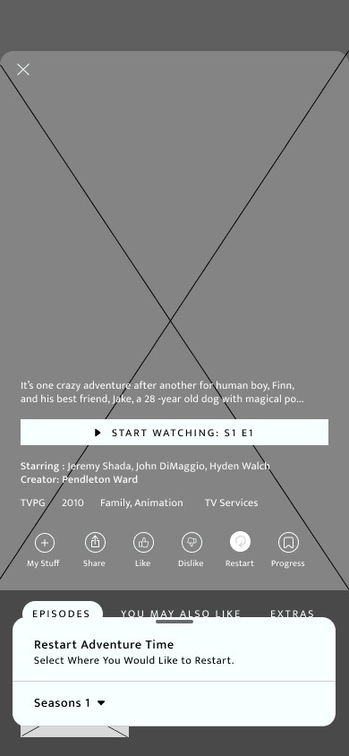
Users reported having the restart button located on the shows menu screen. Many users have mentioned the need to distance the restart button from the play/ start episode button to avoid any accidental clicking. The addition of a confirmation pop up screen was introduced to avoid this potential issue.
User Interview:
I interviewed 4 current Hulu users in order to get a deeper perspective on their thoughts and feelings on the addition of the restart feature. The interviewee’s were made up of 3 women and 1 male ranging in age from 25-35.
The idea of the addition of the restart feature has received positive feedback with one user stating the following…
“I think it is a smart idea and I'm surprised it hasn't been added to the app already. I feel like it should be added.”
With users being interviewed reporting frequently re-watching shows we can determine the desire and need to simplify the current re-watching process. Currently users have to manually move the progress bar back to the beginning of every episode of a show in order to restart them.
Users interviewed also shared interest in the ability to bookmark users progress in a show before restarting the show.
“I think the feature is a great idea and would appreciate it if I could still see where I left off on the show or movie before I re-watched it.” and “I think it would be smart to have a bookmark option, that way I can bookmark where I was in the show before I restart it in case I accidentally click the button or want to go back to where I was.” Users wanted to know where they were in case they wanted to go back and continue where they originally left off."
Analysis and Planning
Product Roadmap:
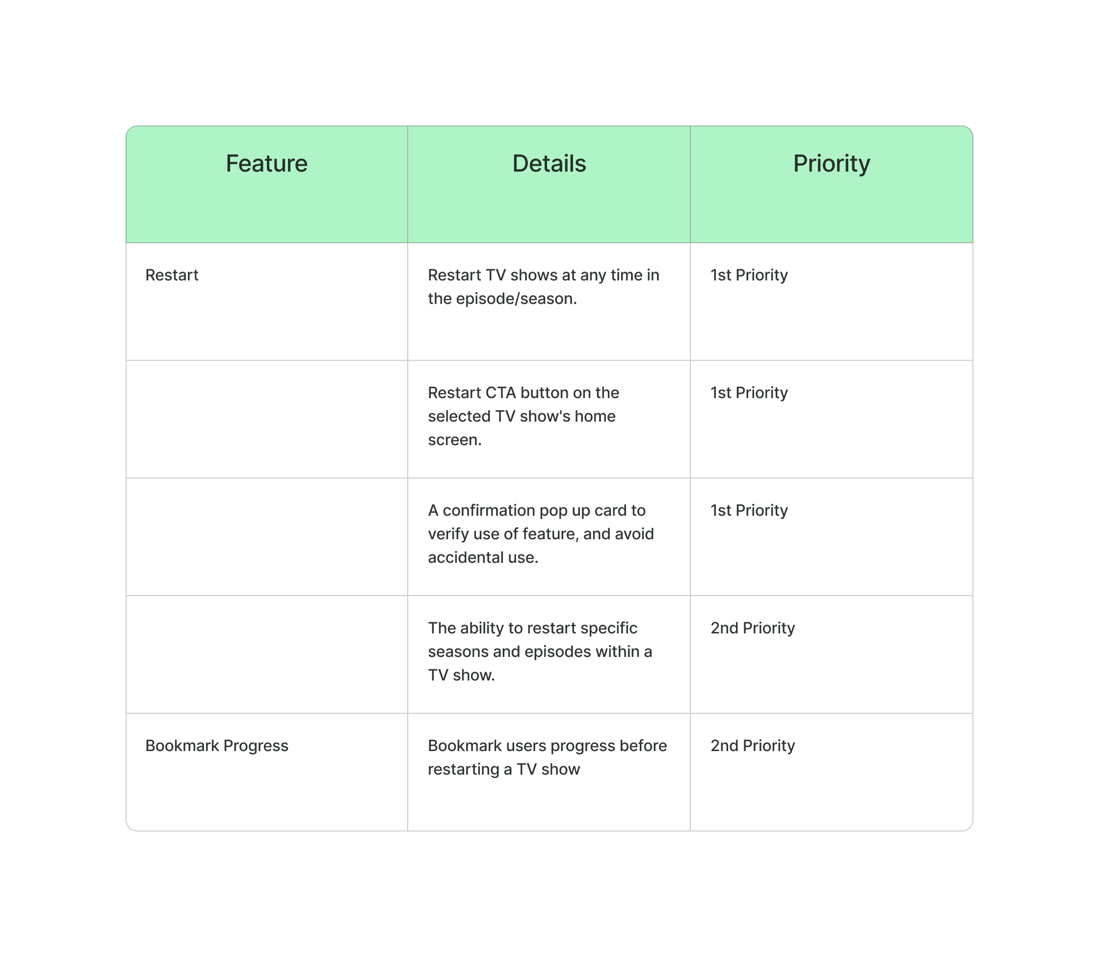
The creation of a product roadmap allows me to view the feature specifications in the order of priority. This was added to the project's timeline do determine which details of the features would be added to the design.
User Personas:
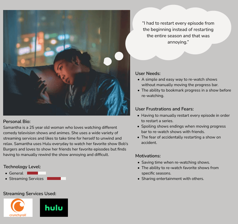
User personas where created to help give a face for potential users. User personas provide a deeper look into possible users and their habits as while as their experience with other applications.
Site Mapping:
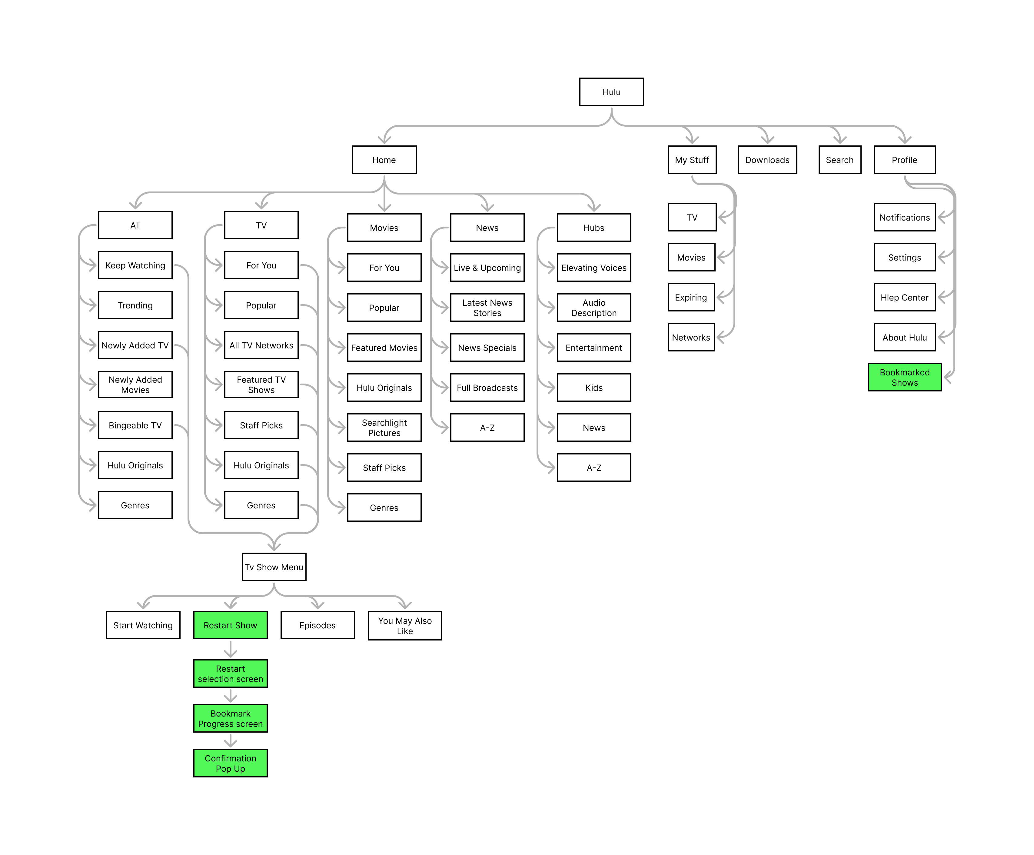
With the findings from the user surveys and interviews, I created a sitemap for the app’s main navigation.
User Flows:
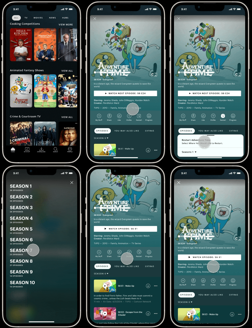
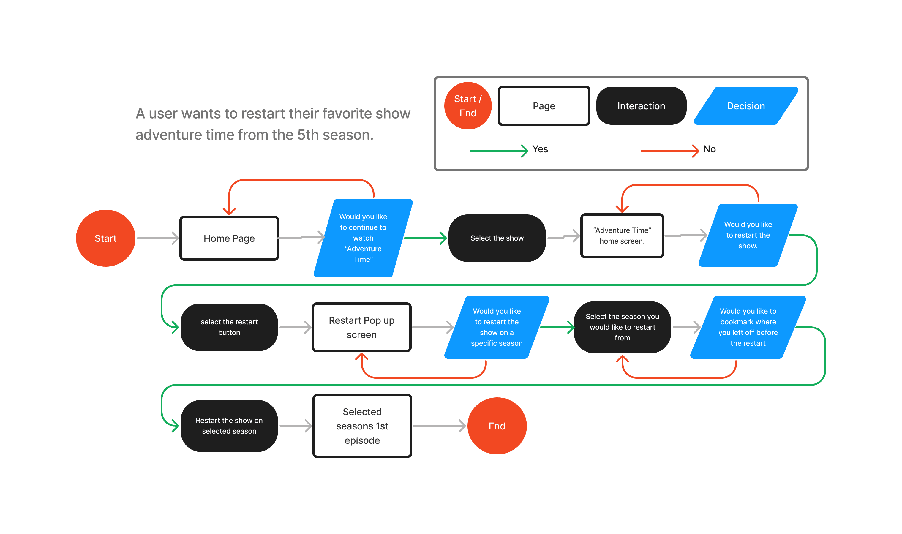
With the sitemap created and the features different screens added a user flow was created to show how a user might interact with the feature. The following is a flow for a user looking to restart their favorite show Adventure Time from its 5th season.
Design
Mid-Fidelity Wireframes:
With the use of Hulu’s current design and layout I was able to create Mid-fidelity wireframes. In order to make the feature’s inclusion seamless blend into the current design, layouts and design elements where used from previous existing features.
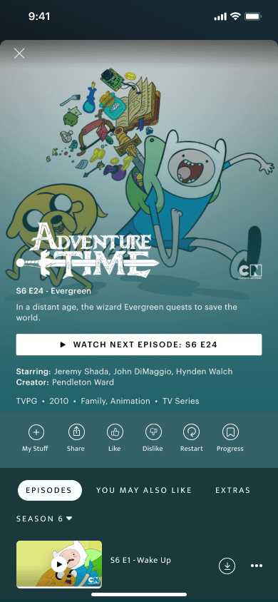
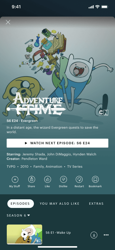
By keeping the design like Hulu’s current design, we designed the TV show home screen menu to include the new features “bookmark” and “restart” CTA buttons to be similar and in line with the current CTA menu.
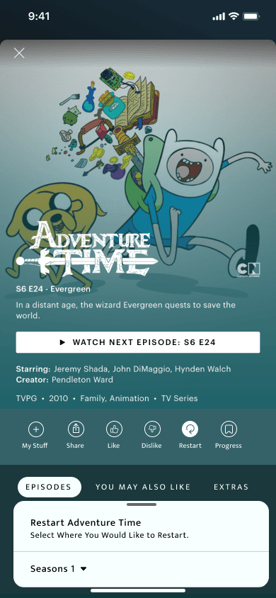
The addition of a pop-up was included to be designed like Hulu’s current pop-up.
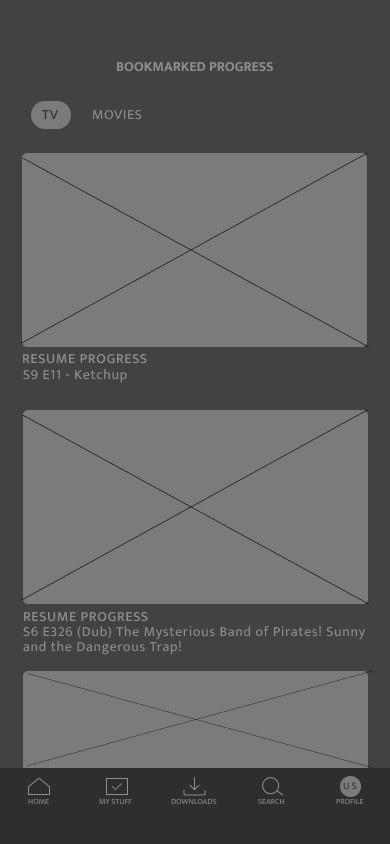
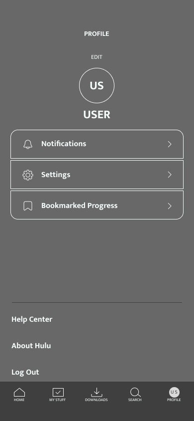
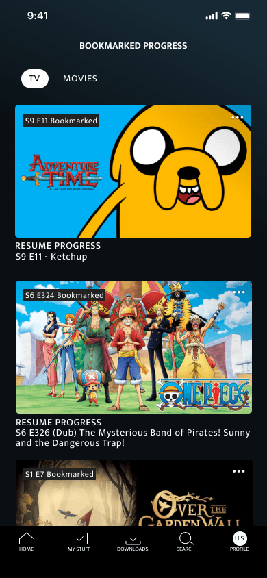
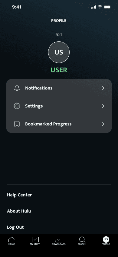
The bookmark feature allows users to bookmark and save their progress on a show before restarting it. The design was made for the user to view all bookmarked progress through the user’s profile.
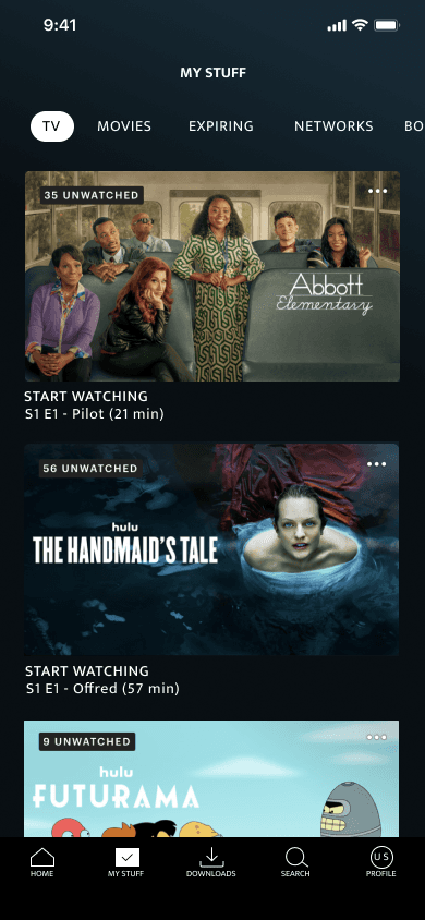
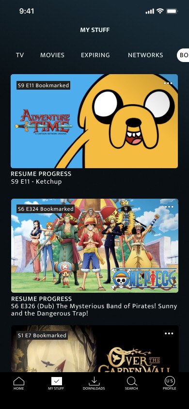
The Bookmarked Progress screen is like Hulu’s current “My Stuff” screen.
High-Fidelity Wireframes:
It was now time to add some color and life into the design and wireframes! Currently Hulu’s UI kit is unavailable for public use, because of this I created my own UI kit by matching typography types and styles as well as colors and iconography.
Restart Feature:
Here we can see the selection of the restart feature, as well as the pop-up allowing the user to select which season they would like to restart from. The selected icon follows the same design principles as current icons.
Bookmarked Progress Feature:
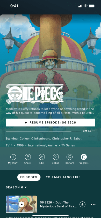
Here we can see a user’s flow from selecting the bookmark progress icon, to viewing their bookmarked progress in the user’s profile.
The bookmarked progress screen allows users to go back to saved episodes in a show before restarting. Many users mentioning wanting to be able to save their progress before restarting a show. By placing the bookmarked screen inside the users profile it allows for easier finding.
Testing
Usability Testing:
We conducted 4 usability surveys, 2 in person and 2 remotely. The decision to conduct the testing in person and remotely was due to the fact we wanted to see the user’s real interaction with an app they already use. In doing so we could get real in-person thoughts and emotions on the design and flow of the features.
Summary of Findings:
With the usability testing completed we took the user’s insights and pain points and created an affinity map to better view the iterations needed to be made.
What Worked:
The following are what worked well within the design as well as comments made by the users during testing.
• Users enjoyed the look and symbols of the new features CTA buttons added on the show’s home screen.
• The process of using the restart feature.
• The process of returning to bookmarked shows progress.
• Liked the layout of the bookmarked screen.
What Needed Fixing:
The following are these issues found when observing users’ interaction with the design as well as the comments made by users…
• Users had a difficult time finding the bookmarked progress. Looked in “my stuff and the shows home screen.
• Season selection CTA is difficult to select.
• Difficulty understanding the bookmarking icon.
Iteration
From the feedback and insights gained from usability testing Iterations where created to better suit user needs and provide users with a better experience.
Bookmark Iterations:
The first iteration was made with the change of the bookmark features label. The label “Progress” was changed to “Bookmark” to provide users with an easy-to-understand process.
Bookmarked Progress Page Iterations:
Many users when asked to view their bookmarked shows initially went looking for the screen in Hulu’s “My Stuff” section instead of their Profile, because of this we decided to move the bookmarked shows into the “My Stuff” section.
Launch
The Next Steps:
To proceed, we'll collaborate closely with developers to integrate these features into Hulu's platform. Concurrently, we'll continue refining the design through ongoing usability testing to ensure an optimal user experience.

