Client:
Gina Eaton
My Roles:
UX Researcher
UX/UI Designer
Prototype Testing
Duration:
4 Weeks
Gina Eaton is a licensed psychotherapist and certified hypnotherapist with over 25 years of experience. She has worked with people of all ages living with a variety of mental illnesses like depression, anxiety, eating disorders and post-traumatic stress disorder.
The Problem
The Process
Research
Research Objectives:
Designing an up-to-date, modern website will increase its traffic and provide potential new clients with current information, leading to less confusion and greater trust in the brand
Enhance website traffic by updating its user interface to better align with her brand's identity.
Update outdated information such as accepted insurance providers, location details, etc.
Refresh the current logo to better suit a more modern design
Competitive Analysis:
I started by researching websites of various therapists in Gina Eaton's area to compare their layout and design. Additionally, I analyzed the content within these websites based on their information architecture. It was crucial to assess the competitors' websites on both desktop and mobile devices to check responsiveness.
Lilac Counseling
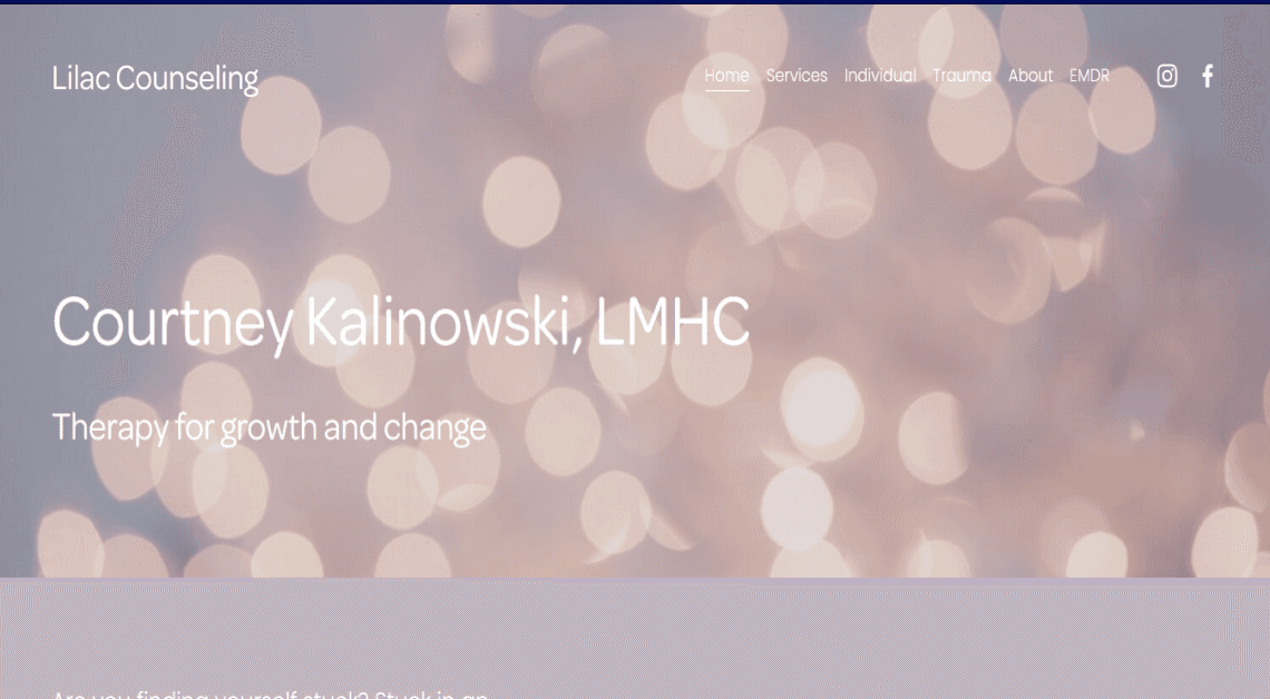
Strengths
Simple and well throughout navigation with drop down menus.
Has footer with social medias accessible for further interaction.
Easy to find and read CTA buttons
Website matches with brand identity and name.
Weaknesses
Homepage is difficult to read due to light background and white font color.
Text sizes vary and are not consistent on homepage.
No descriptions of services provided on “services” page.
CTA buttons on mobile view vary in location and don't follow the same flow.
Photos in mobile view are cropped awkwardly.
Manifest Psychology
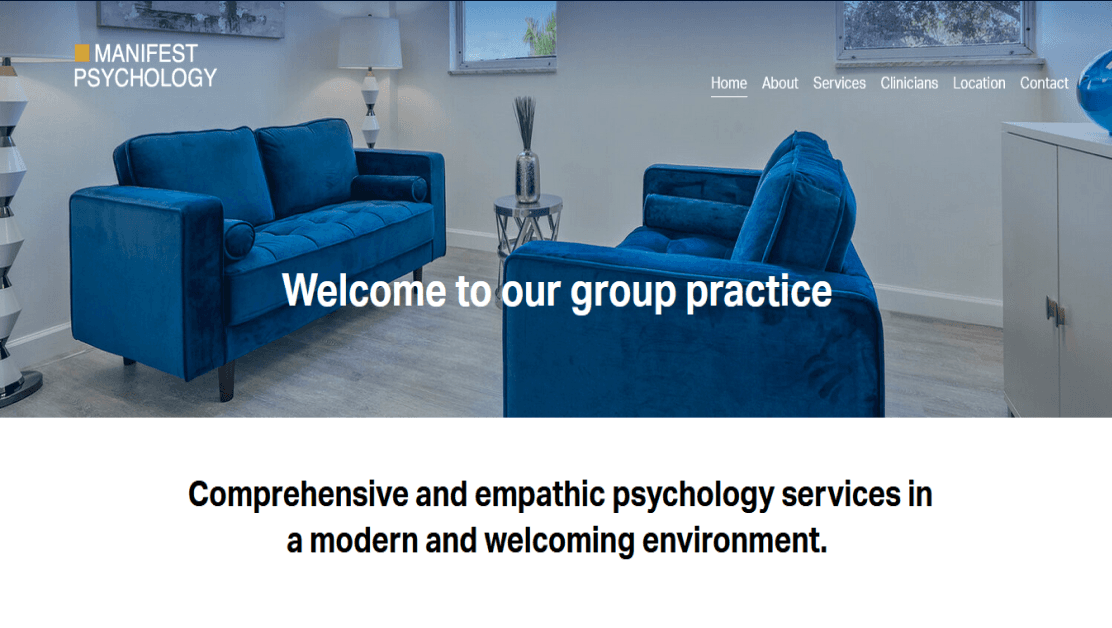
Strengths
Calming color theme that looks clean and well put together.
Easy to understand icons and hig quality photos.
Typography is easy to read and well paired.
Offer a wide variety of service from virtual to forensic assessments.
Detailed staff descriptions.
Website is responsive on mobile and tablet.
Weaknesses
Information architecture is confusing and difficult to follow.
The CTA buttons can be difficult to see and don't stick out.
No footer.
Sunshine Therapy Services
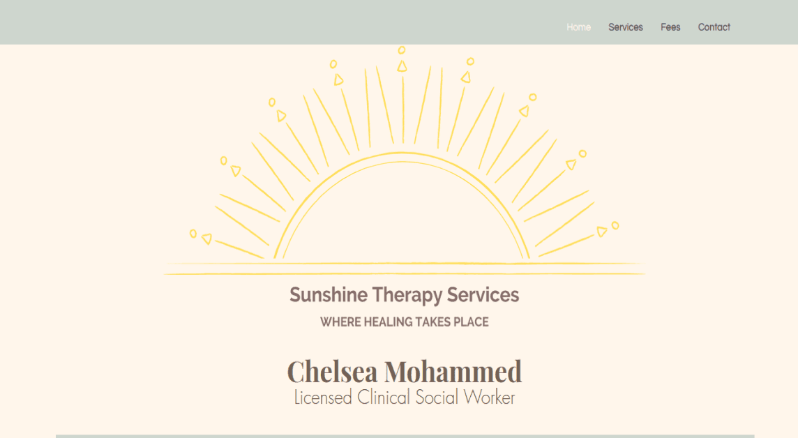
Strengths
Good information architecture on home and fee pages.
High quality photos.
Good font pairings for heading and subheadings.
Provides fee of different types of therapy for users to see before they make an appointment.
Weaknesses
Illustrations are not properly cropped on home page.
Colors of text are difficult to read on background, this could be an accessibility issue for users who are colorblind.
Services navigation tab is unelectable.
Website is crammed and overlaps text on mobile viewing.
Stakeholder Interview:
I spoke with the stakeholder to understand her vision for the website. She expressed the desire to offer potential clients a more modern and up-to-date online experience. She requested the following elements to be redesigned and updated on her website:
Updated information regarding health insurance offerings on the "Contact Us" page.
Implement a plant-themed color palette with nature images.
Enhance the navigation bar with a modern design.
“It needs to flow a little better and just look a little bit more just professional and maybe a little bit more detail.”
User Interview:
Due to HIPAA laws, I was only able to speak with one of Gina's clients. She is a young adult who shared her thoughts and concerns regarding Gina Eaton's current website design
“She lists a whole bunch of services that she provides, but then in the drop down menu, those services aren't there. And then her about us doesn't have anything about her.”
“I feel like it's very surface level. There's not a ton of information and the information she does have a lot of it is outdated. "
User Survey:
HIPAA laws prevented me from obtaining contact information for current clients. To address this, I collaborated with the stakeholder to create and distribute an anonymous survey that clients could fill out without violating any HIPAA laws. The survey covered topics related to the current website's navigation, content, and visual design. By combining insights from the interviews and the survey responses, I was able to create an affinity map based on user experience.
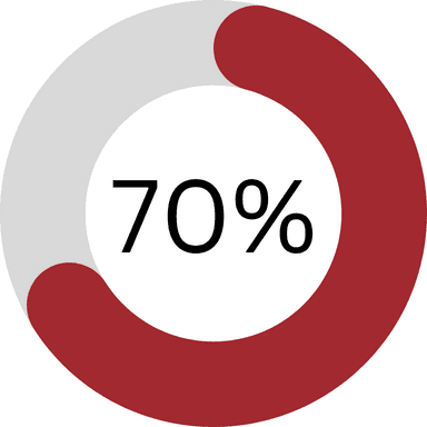
Over 70% of Gina Eaton's current users reported being unaware of her services.
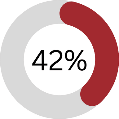
Around 42% of current users reported wanting to learn more about the services Gina Eaton offers.
Analysis and Planning
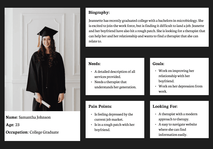
User Personas:
By comprising the information gathered through user interviews I was able to create user personas to better understand the needs and pain points of different potential users.
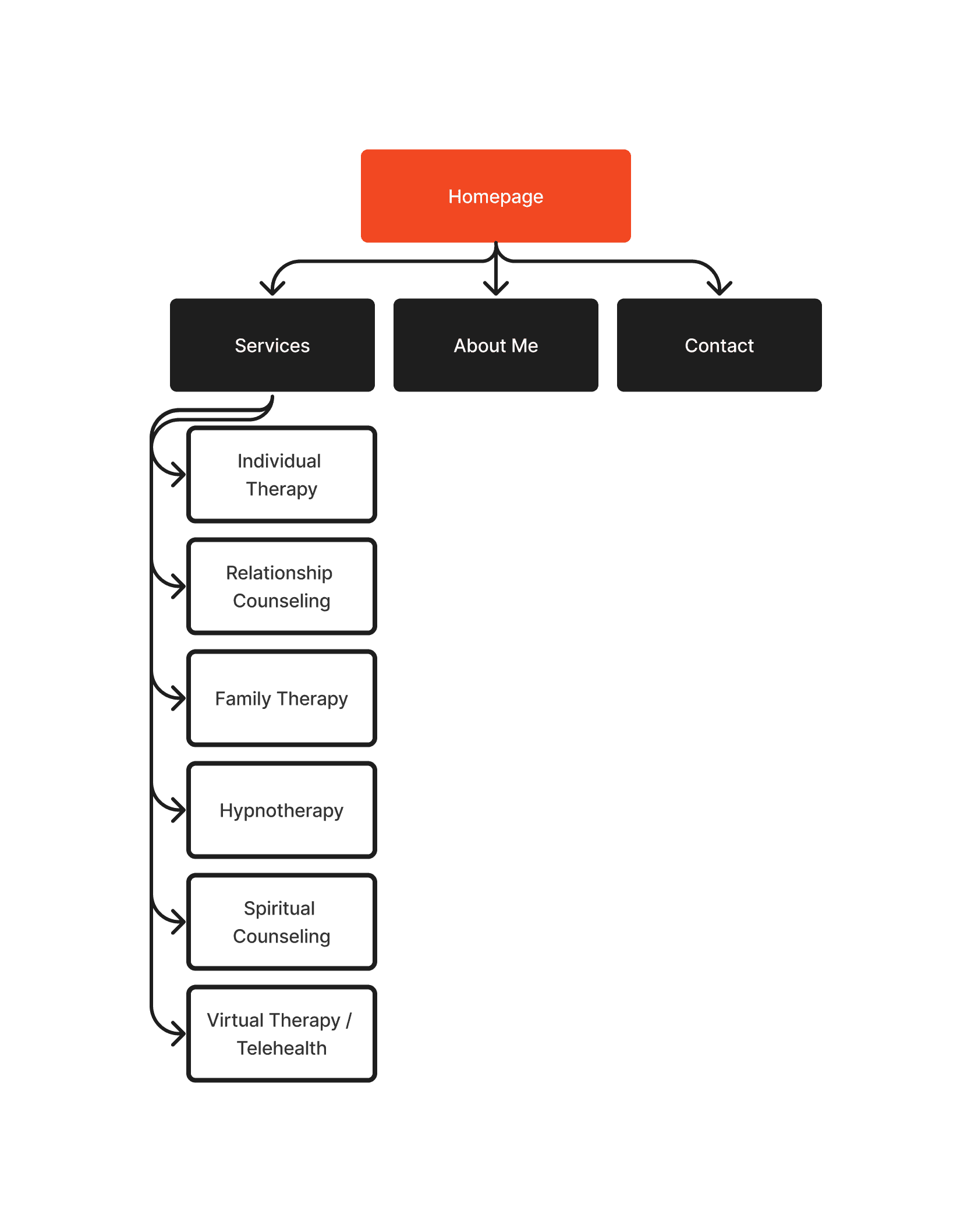
Site Mapping:
With the findings from the user surveys and the stakeholder interview I created a sitemap for the app’s main navigation.
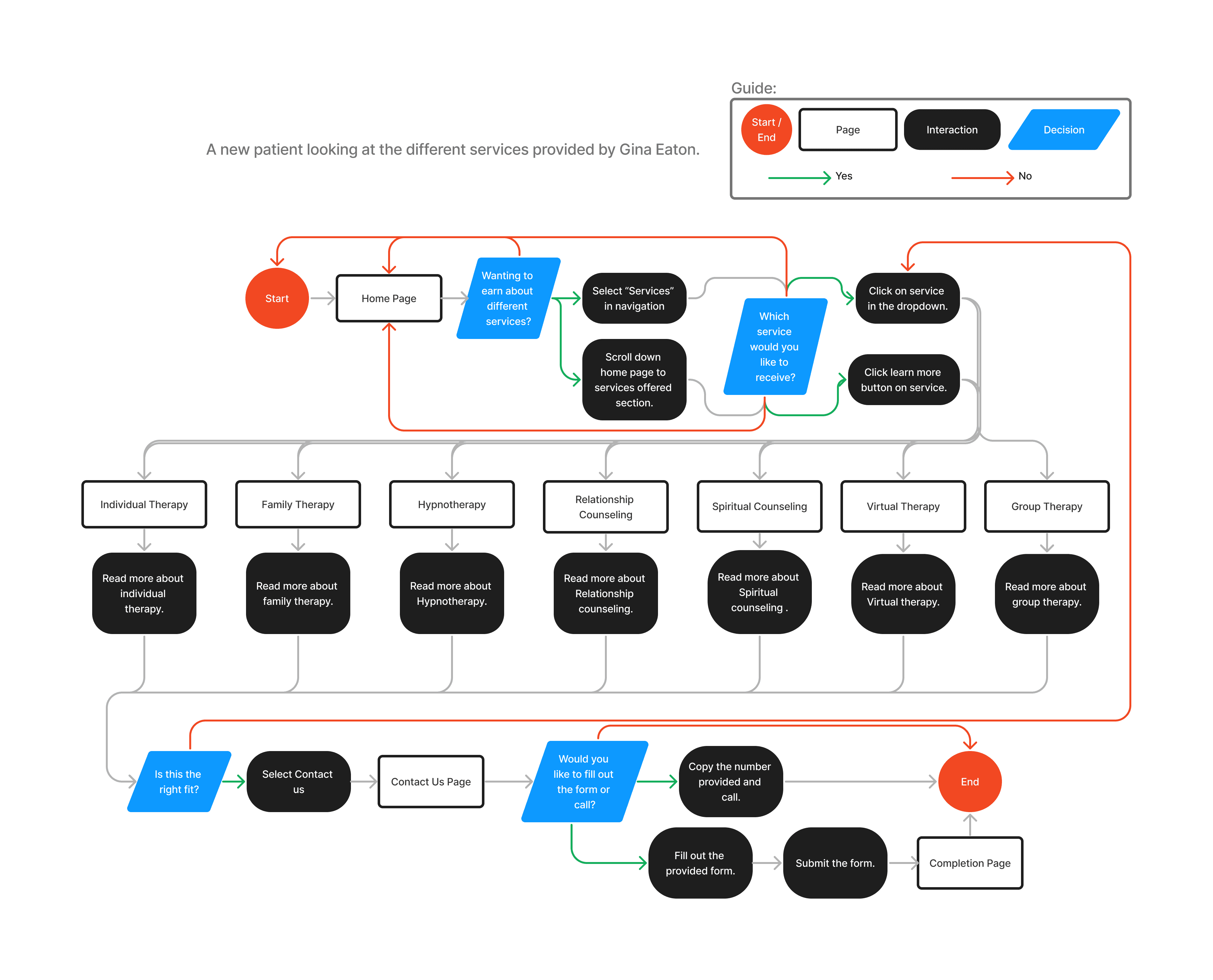
User Flows:
With the sitemap created and the apps main navigation complete I created user flows in order to show how a potential user would interact with the navigation. Below is a user flow showing how a user would navigate the website in order to determine which service is the best fit for them.
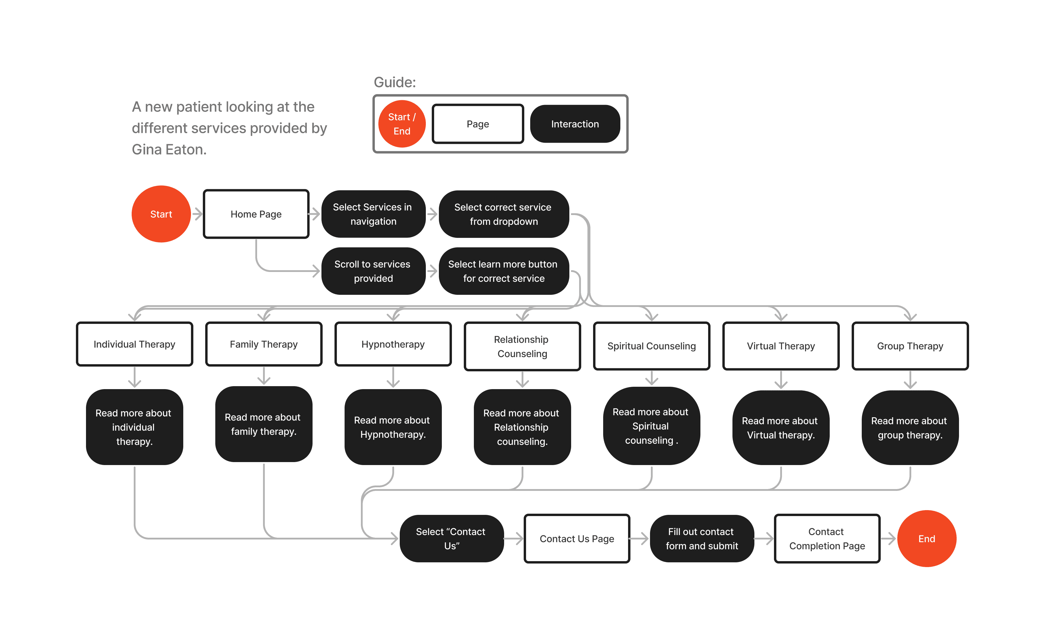
Task Flows:
After creating the user flows, I created task flows to provide me with the users perfect path through the app’s emergency button feature. A new patient looking at the different services provided by Gina Eaton.
Design
Mid-Fidelity Wireframes:
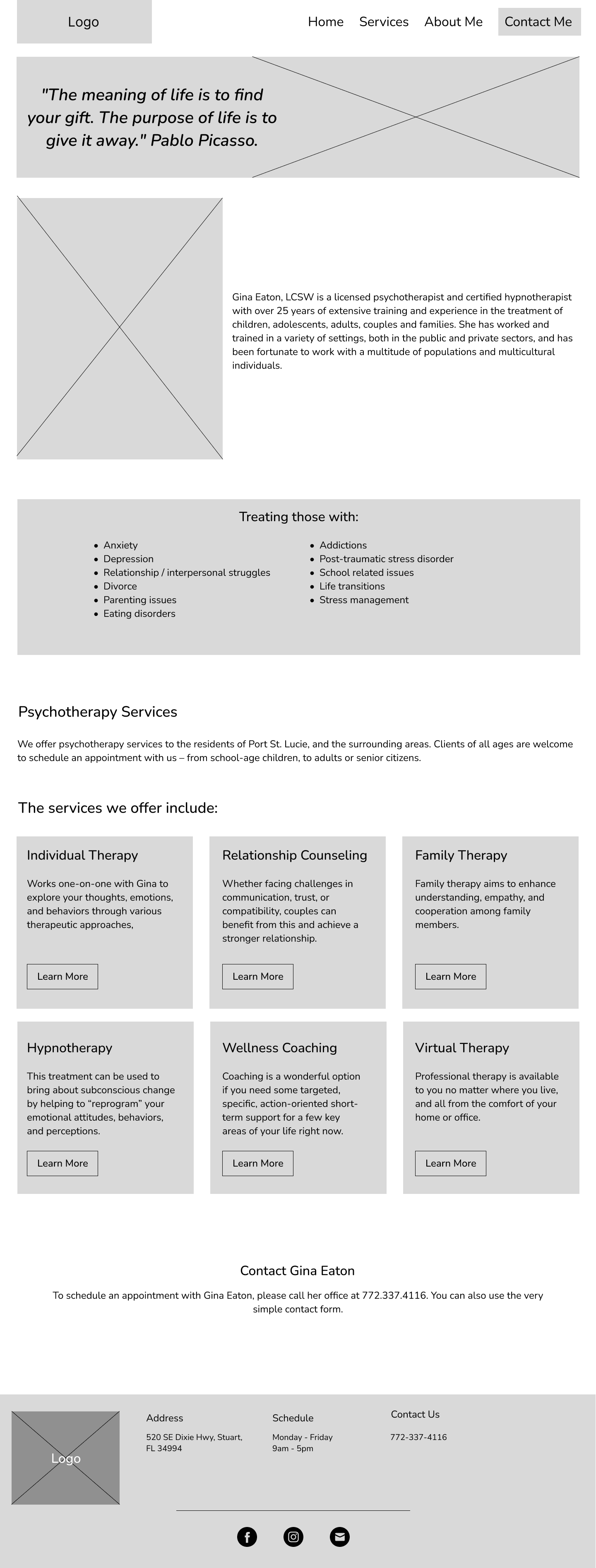
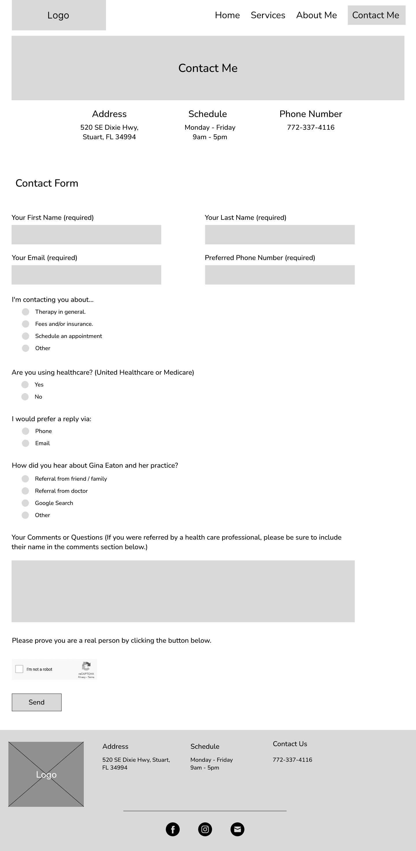
By merging the existing website's navigation with the new sitemap, user flows, and task flows, I developed mid-fidelity wireframes. The decision to skip low-fidelity wireframes and proceed directly to mid-fidelity was deliberate. This approach aims to accelerate the redesign process while offering the stakeholder a design closely resembling the final product.
The stakeholder expressed a desire for users to learn more about her personal story. In response, we added a quote that holds significance to her journey and is prominently displayed in her office as a header on the website's home screen design, honoring the importance of her story.
The primary issue reported by users was the lack of clear information architecture, particularly regarding services provided and Gina Eaton's story. To address this, a service section was added to the home page, providing descriptions of each service for easy access. Additionally, Gina Eaton's story was prominently featured at the top of the home page, offering users a welcoming introduction to her practice.
A footer was added to provide a more professional look and provide users with quick information and links to Gina Eaton’s social medias.
The navigation bar was intentionally designed to direct users' attention to the Contact Me page. By making the Contact Me CTA button stand out, users are naturally drawn to it.
The Contact Me page was redesigned with a modern and user-friendly flow. The contact form was updated to ensure users receive accurate information.
Brand Identity:
When discussing the new design with the stakeholder, she expressed a desire for an earthy color palette with a professional feel. In response, I created a color palette that complements the images used and aligns with the company's logo."
High-Fidelity Wireframes:
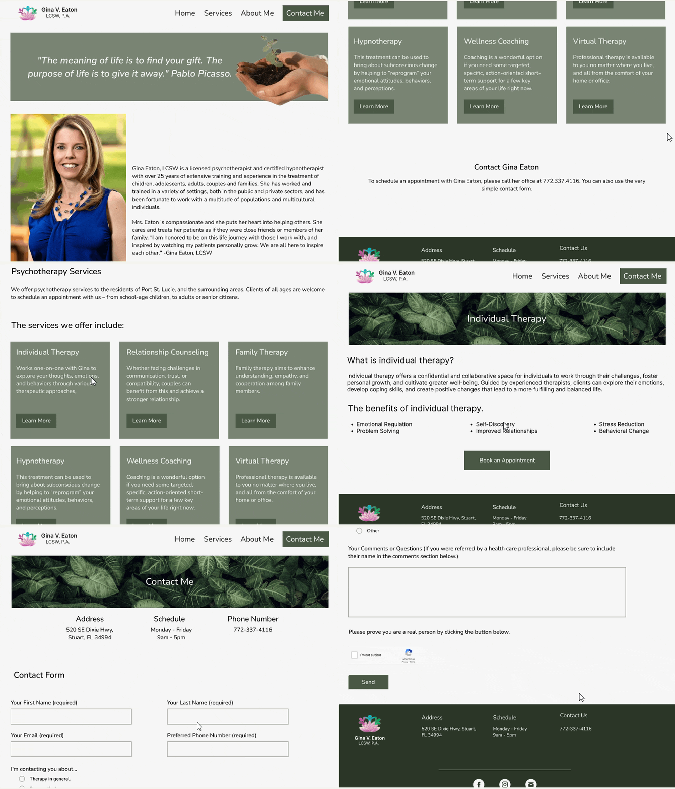
After collaborating with the stakeholder to develop a brand identity and style guide, I proceeded to create high-fidelity wireframes. My aim was to deliver the professional, clean, and organized appearance she desired, incorporating earthy tones consistent with the brand's identity.
The design was crafted to showcase Gina Eaton's services and treatments, offering users a deeper insight into both herself and her practice. By incorporating white space, the design achieves the professional and welcoming look desired by the stakeholder, while also providing users with a clean and easily digestible experience.
By keeping the CTA buttons the same color allows for a better consistency and a faster learning time for users to understand the design.
At the stakeholder's request, I incorporated plants into the design of various screens by using them as part of the header for specific screens.
Testing
Usability Testing:
Both desktop and mobile designs were utilized for usability testing to assess user navigation, task completion, and gather feedback on the design. I conducted an unmoderated usability test using Maze, with 5 users aged 23-27 completing the test.
Summary of Findings:
Using the insights gathered from the test, I created an affinity map to analyze what worked well and what needed improvement. The usability testing revealed the following:
The design was praised for being easy to navigate and received positive feedback for its overall design.
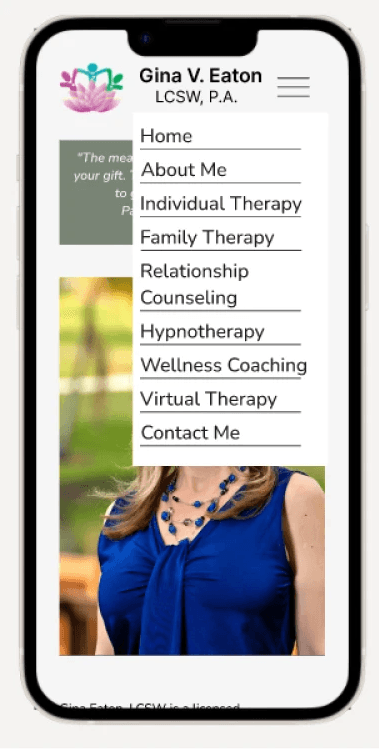
Users found the drop-down menu for mobile to be cluttered, suggesting the need for a sub-menu.
The layout of the navigation on mobile was positioned too high on the screen, indicating the need for adjustment to lower it.
Iteration
From the feedback and insights gained from usability testing Iterations where created to better suit user needs and provide users with a better experience.
Mobile Menu Dropdown and Layout:
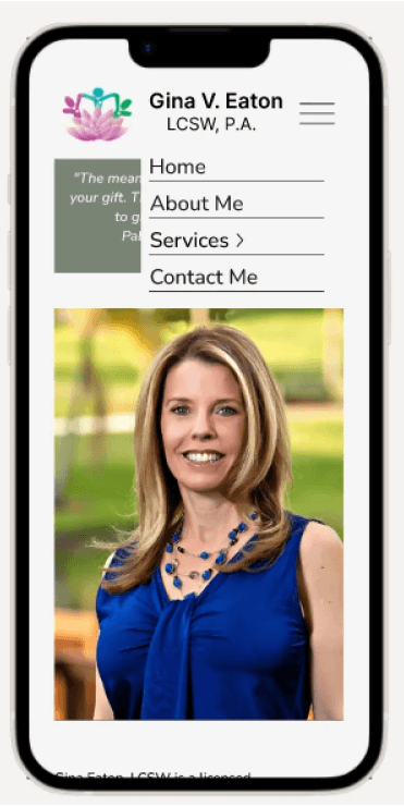
Users reported that the menu design on mobile devices was cluttered and made finding information difficult. To address this, a sub-menu was added to streamline navigation. Additionally, the navigation on mobile was lowered to improve layout and ensure better fit on mobile devices.
Previous Design
Iterated Design
Launch
The Next Steps:
After receiving final approval from the stakeholder, the design will be handed off to her developer. Once the hand off is completed, the redesigned website will go live!


